As part of our reset, refresh, and renew themed month, each Thursday, I want to show you a room in my recently renovated house. The reason is simple: many of us are spending a lot more time in our homes. And many of us have or are going to embark on a refresh/renovation of our homes. My hope is to provide you with a little inspiration for your project(s). Last week, I took you through my studio basement. Today, I want to give you a tour of my renovated master bathroom. Take your shoes off again, and come on in. Let’s get started.
Original bathroom
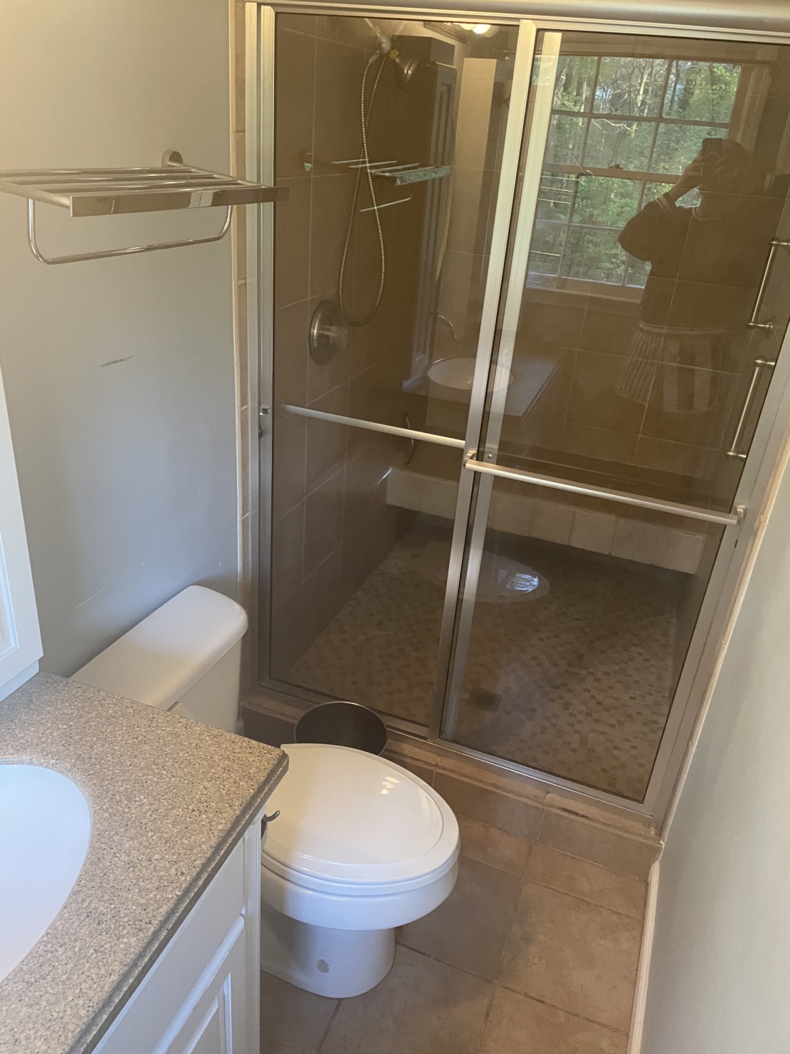
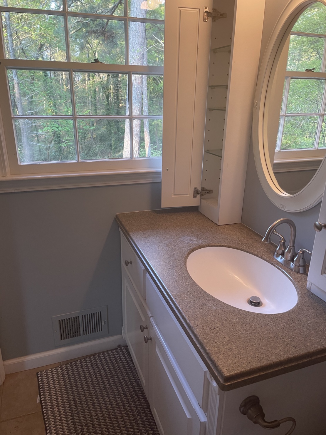
I actually have never given a glimpse of my bathroom on the blog. So here it is—the original state of things. Not much to say here, other than I want you to notice how small and (arguably) inefficient the space was used. This is important because I didn’t change the bathroom’s footprint during the remodel. The master bathroom comes in at 5’X18′, definitely small for a master bathroom, but that’s how many homes in the 70s were built.
Wallpaper (Anthropologie) | Ceiling light fixture (Wayfair) | Antique Brass Sconces (Wayfair) | Train Rack (Wayfair) | Drawer Pulls | Knobs | Sink Faucet | Shower Faucet & Handle | Adjustable Slide Bar | Kohler Cimmaron Toilet | Toilet Paper Holder | Towel Hook | Towels | Shower Curtain | Tissue Holder | Soap Dispenser | Glass Cannisters | Harlequin Rug | Simplehuman Mirror | Silicone Hair Tool Holder | Drawer Organizer | Lipstick Organizer
Wallpaper (Anthropologie) | Ceiling light fixture (Wayfair) | Antique Brass Sconces (Wayfair) | Train Rack (Wayfair) | Drawer Pulls | Knobs | Sink Faucet | Shower Faucet & Handle | Adjustable Slide Bar | Kohler Cimmaron Toilet | Toilet Paper Holder | Towel Hook | Towels | Shower Curtain | Tissue Holder | Soap Dispenser | Glass Cannisters | Harlequin Rug | Simplehuman Mirror | Silicone Hair Tool Holder | Drawer Organizer | Lipstick Organizer
Shop the Post (below)
The process
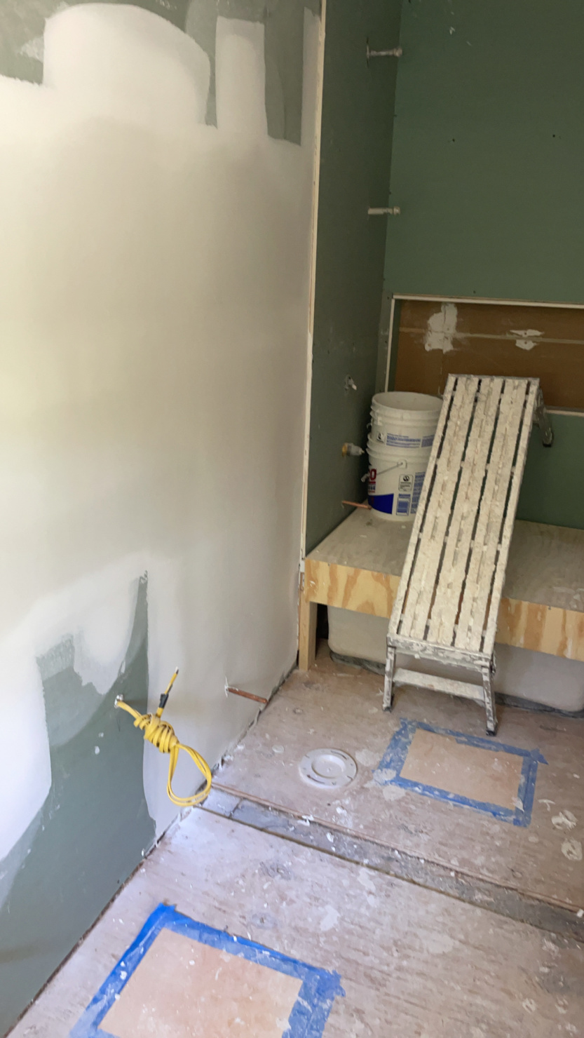
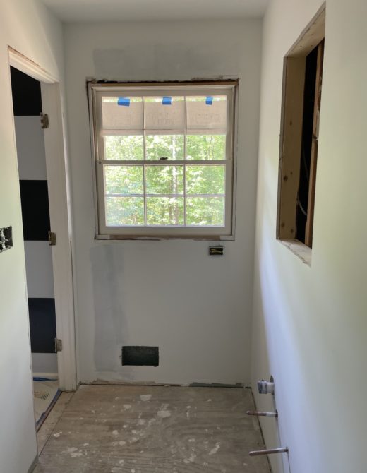
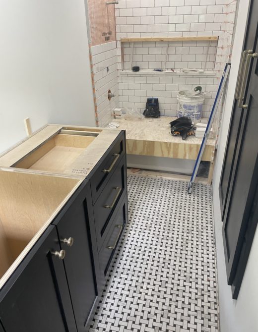
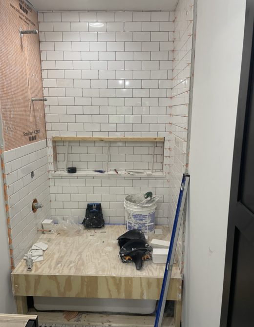
Nothing more exciting than demo day and the ensuing process. With all of the planning and design work done, it’s time to get down to business. From start to finish, this remodel took six weeks. (Same as the basement.) Not bad, really. And what’s even more important: the team was on-time and on schedule the whole way through.
Wallpaper (Anthropologie) | Ceiling light fixture (Wayfair) | Antique Brass Sconces (Wayfair) | Train Rack (Wayfair) | Drawer Pulls | Knobs | Sink Faucet | Shower Faucet & Handle | Adjustable Slide Bar | Kohler Cimmaron Toilet | Toilet Paper Holder | Towel Hook | Towels | Shower Curtain | Tissue Holder | Soap Dispenser | Glass Cannisters | Harlequin Rug | Simplehuman Mirror | Silicone Hair Tool Holder | Drawer Organizer | Lipstick Organizer
Wallpaper (Anthropologie) | Ceiling light fixture (Wayfair) | Antique Brass Sconces (Wayfair) | Train Rack (Wayfair) | Drawer Pulls | Knobs | Sink Faucet | Shower Faucet & Handle | Adjustable Slide Bar | Kohler Cimmaron Toilet | Toilet Paper Holder | Towel Hook | Towels | Shower Curtain | Tissue Holder | Soap Dispenser | Glass Cannisters | Harlequin Rug | Simplehuman Mirror | Silicone Hair Tool Holder | Drawer Organizer | Lipstick Organizer
Shop the Post (below)
Remodeled bathroom
Ah, the big reveal. Here is the finished project. I won’t say too much right now. Just wanna let you take a look.

Wallpaper (Anthropologie) | Ceiling light fixture (Wayfair) | Antique Brass Sconces (Wayfair) | Train Rack (Wayfair) | Drawer Pulls | Knobs | Sink Faucet | Shower Faucet & Handle | Adjustable Slide Bar | Kohler Cimmaron Toilet | Toilet Paper Holder | Towel Hook | Towels | Shower Curtain | Tissue Holder | Soap Dispenser | Glass Cannisters | Harlequin Rug | Simplehuman Mirror | Silicone Hair Tool Holder | Drawer Organizer | Lipstick Organizer
Wallpaper (Anthropologie) | Ceiling light fixture (Wayfair) | Antique Brass Sconces (Wayfair) | Train Rack (Wayfair) | Drawer Pulls | Knobs | Sink Faucet | Shower Faucet & Handle | Adjustable Slide Bar | Kohler Cimmaron Toilet | Toilet Paper Holder | Towel Hook | Towels | Shower Curtain | Tissue Holder | Soap Dispenser | Glass Cannisters | Harlequin Rug | Simplehuman Mirror | Silicone Hair Tool Holder | Drawer Organizer | Lipstick Organizer
Shop the Post (below)
Tour of my renovated master bath
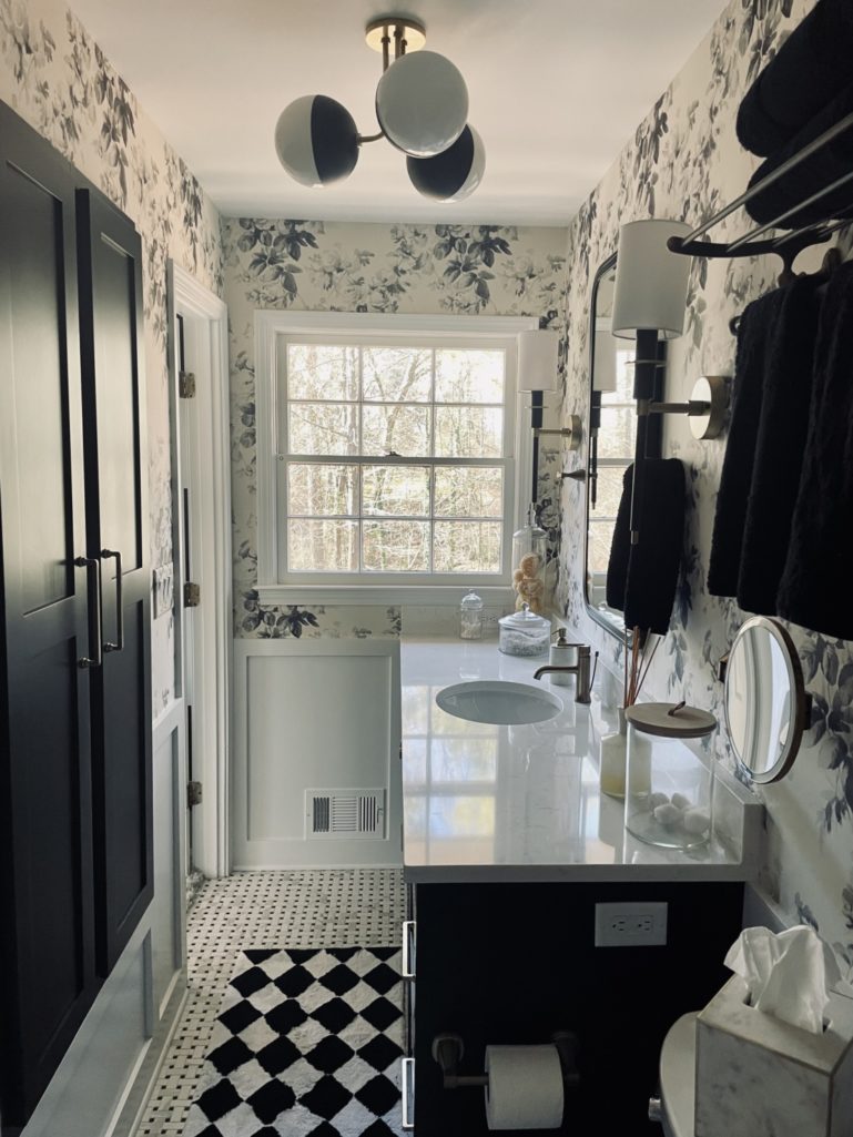
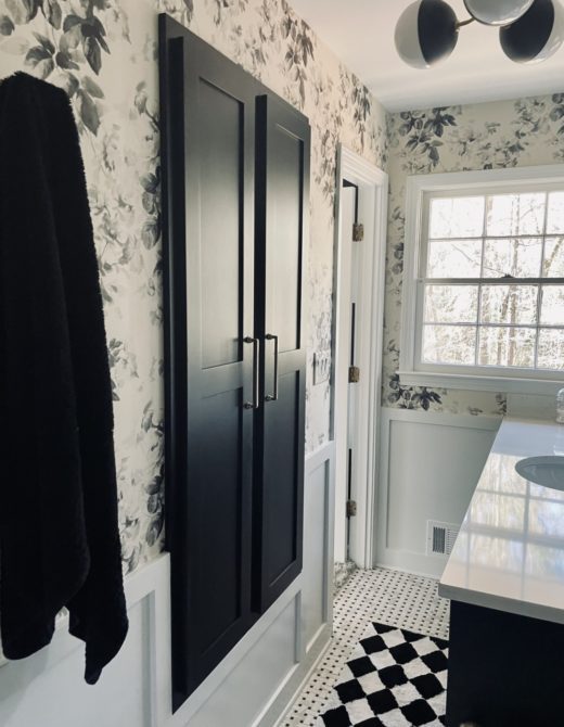
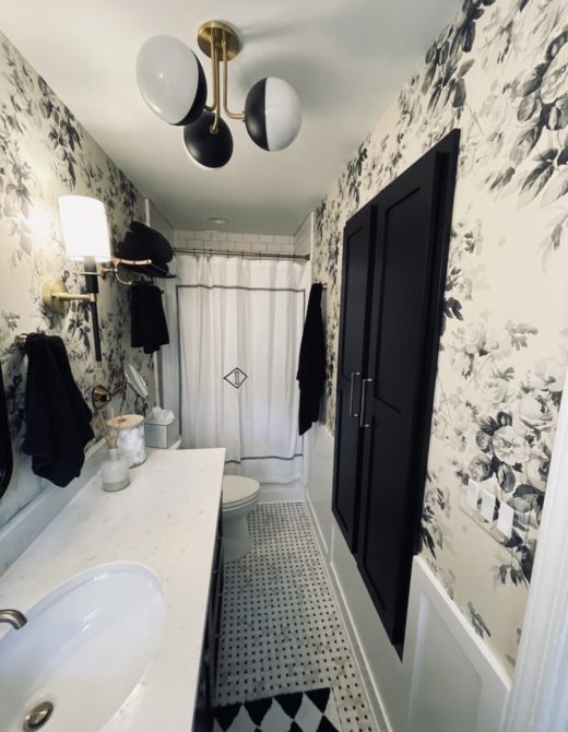
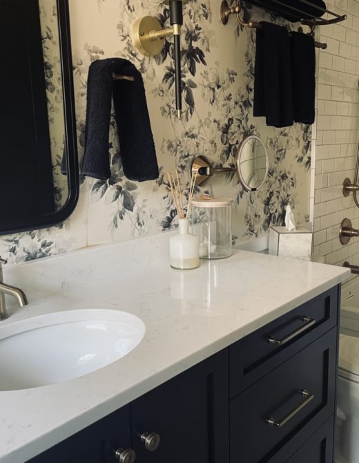
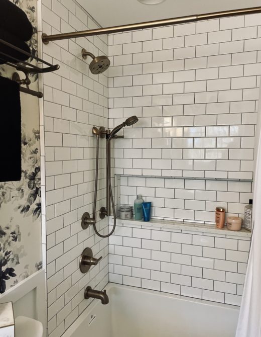
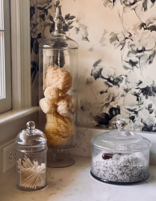
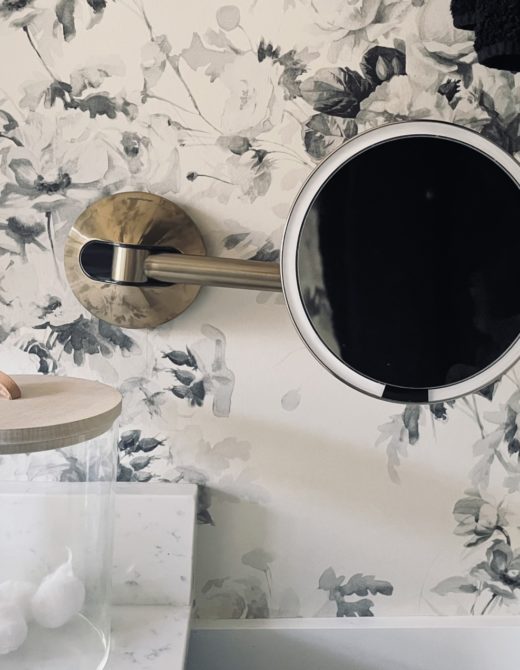
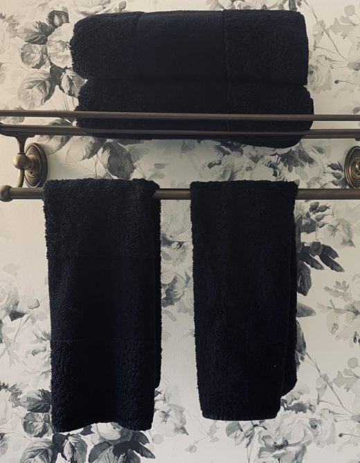
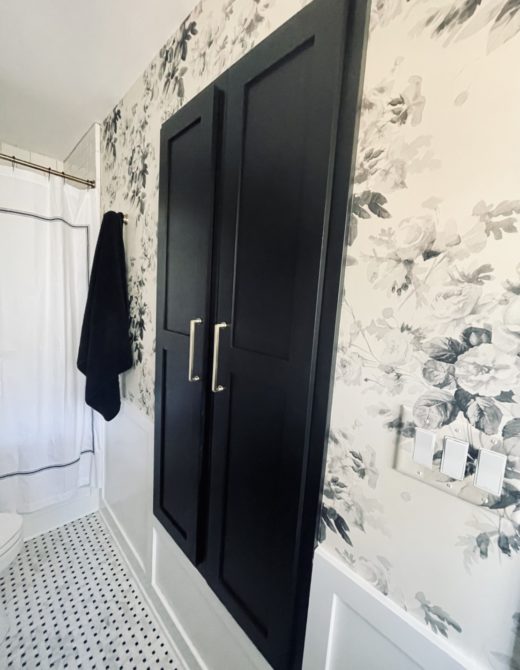
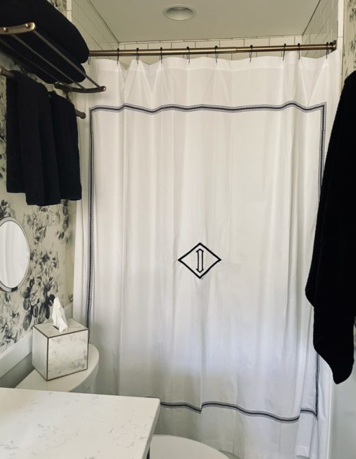
Ok, now for the tour of my renovated master bath. The black & white palette serves as the perfect foundation for the bathroom. This tried, and true color combo gave me a lot of freedom and flexibility in the direction I wanted to take everything else. (And it’s worth calling out specifically the floral wallpaper. It’s that perfect blend between traditional- and modernism that I really strove for in my entire remodel.)
Just a few notes:
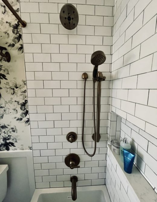
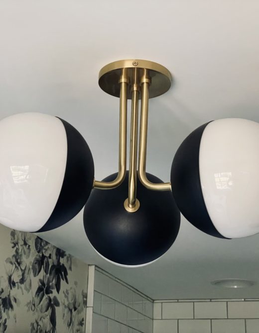
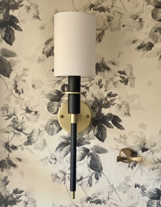
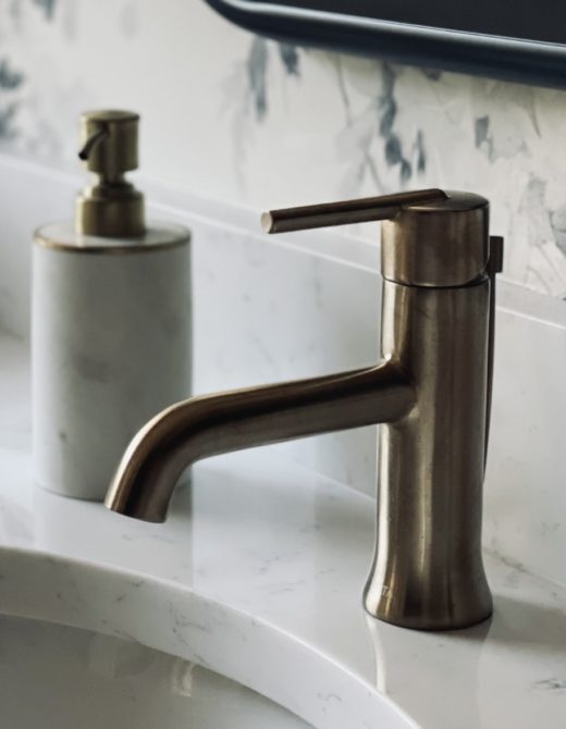
- All of the fixtures, including the sconces, faucet, showerhead, and slide bar, are a sort of antique brass. They give the room just the right amount of pop.
- I swapped the standing shower for a tub because there’s nothing like a good soak.
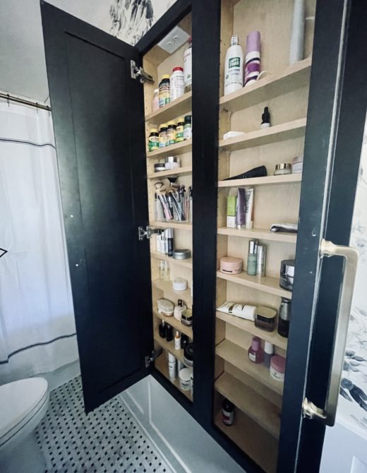
- Although I didn’t change the bathroom’s footprint, I gained a lot of extra storage space by adding a large medicine cabinet across from the sink.
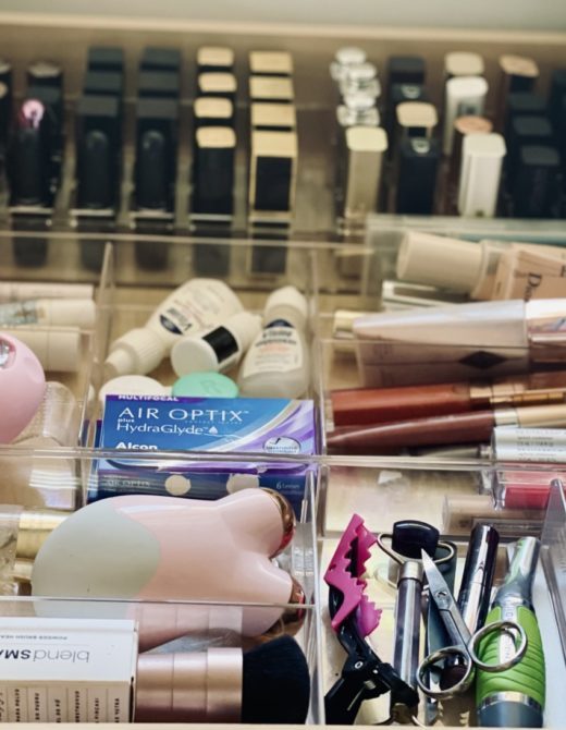
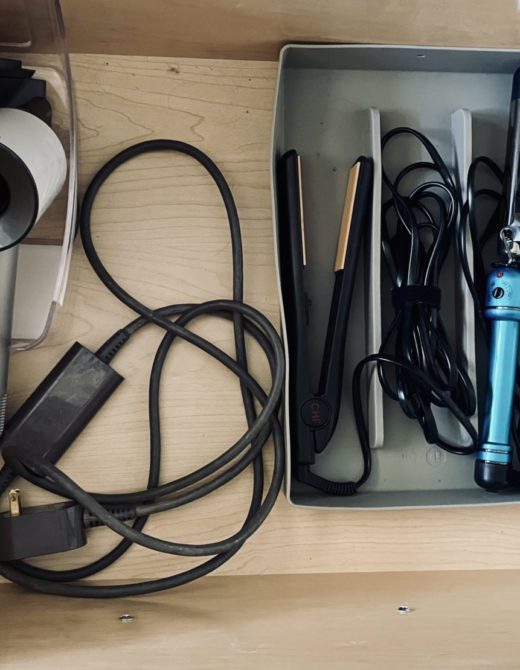
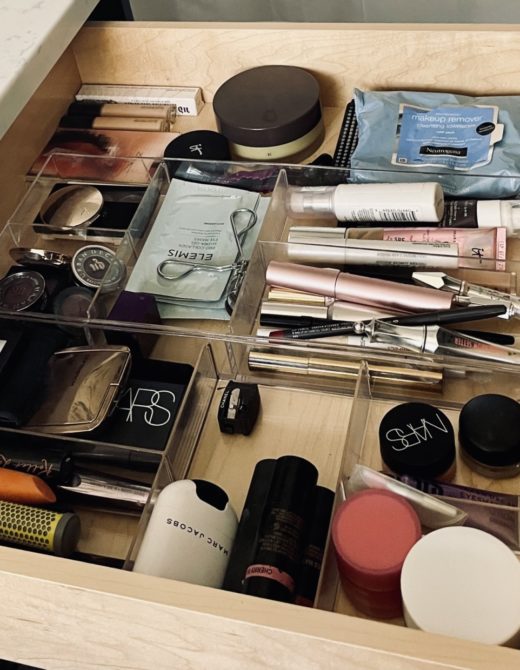
- Given the small space, organization is key, and I spent a lot of time identifying additional organizers to help me maximize the space I do have.
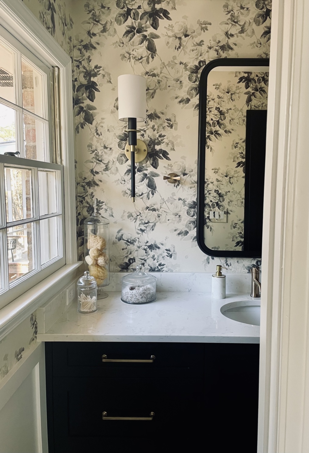
Wallpaper (Anthropologie) | Ceiling light fixture (Wayfair) | Antique Brass Sconces (Wayfair) | Train Rack (Wayfair) | Drawer Pulls | Knobs | Sink Faucet | Shower Faucet & Handle | Adjustable Slide Bar | Kohler Cimmaron Toilet | Toilet Paper Holder | Towel Hook | Towels | Shower Curtain | Tissue Holder | Soap Dispenser | Glass Cannisters | Harlequin Rug | Simplehuman Mirror | Silicone Hair Tool Holder | Drawer Organizer | Lipstick Organizer
Wallpaper (Anthropologie) | Ceiling light fixture (Wayfair) | Antique Brass Sconces (Wayfair) | Train Rack (Wayfair) | Drawer Pulls | Knobs | Sink Faucet | Shower Faucet & Handle | Adjustable Slide Bar | Kohler Cimmaron Toilet | Toilet Paper Holder | Towel Hook | Towels | Shower Curtain | Tissue Holder | Soap Dispenser | Glass Cannisters | Harlequin Rug | Simplehuman Mirror | Silicone Hair Tool Holder | Drawer Organizer | Lipstick Organizer
Wallpaper (Anthropologie) | Ceiling light fixture (Wayfair) | Antique Brass Sconces (Wayfair) | Train Rack (Wayfair) | Drawer Pulls | Knobs | Sink Faucet | Shower Faucet & Handle | Adjustable Slide Bar | Kohler Cimmaron Toilet | Toilet Paper Holder | Towel Hook | Towels | Shower Curtain | Tissue Holder | Soap Dispenser | Glass Cannisters | Harlequin Rug | Simplehuman Mirror | Silicone Hair Tool Holder | Drawer Organizer | Lipstick Organizer
Wallpaper (Anthropologie) | Ceiling light fixture (Wayfair) | Antique Brass Sconces (Wayfair) | Train Rack (Wayfair) | Drawer Pulls | Knobs | Sink Faucet | Shower Faucet & Handle | Adjustable Slide Bar | Kohler Cimmaron Toilet | Toilet Paper Holder | Towel Hook | Towels | Shower Curtain | Tissue Holder | Soap Dispenser | Glass Cannisters | Harlequin Rug | Simplehuman Mirror | Silicone Hair Tool Holder | Drawer Organizer | Lipstick Organizer
Shop the Post (below)
Webber Coleman Woodworks
Just like last week, a special shoutout to Webber Coleman Woodworks, who led the renovations in their entirety. I was introduced to the family-run cabinetry shop here, in Athens, through my daughter-in-law, who also had her bathrooms renovated through Webber Coleman. I can’t recommend this team highly enough. The quality of their work is exceptional, and they hit every deadline on time. (And for anyone that has gone through a renovation, that actually might be the most important thing.). Make sure to follow Webber Coleman on Instagram, especially if you’re looking for inspiration for your home projects.
In case you missed it
Remember, I’m giving you a tour of my newly renovated home all month. Don’t forget to check out last week’s tour of my renovated basement.















Stunning makeover and such good use of space. Such a serene/modern place to get ready to greet and end the day.
it truly is a beautiful yet functional space. it used to be a drudge to step into this bathroom. not it’s a joy.
Love this remodel for a small MB. Often cannot find ideas for ‘70s style home, so thank you! One question, however., why a single sink. Why not have a larger single, or 2 sinks. (For resale value, if not for convenience only.) Again, thank you for creative ideas that show much thought & consideration!
simple. two people cannot fit into this bathroom at the same time. thanks for stopping by!
I also have a lovely 70s house with a small master. I have a long countertop but opted for one sink in my recent remodel. I’d rather have the counterspace! As you say, two people can’t fit in there anyway. The en suite is my bathroom and the main hall bath is my husband’s. I don’t need to watch him brush his teeth! One thing Angelina Jolie said with which I agree: the key to a happy marriage may be separate bathrooms!
ha ha! I think she was right!
Love your bathroom remodel! Can you provide details on your new bathtub?
I was looking for info on the bathtub too – love it! Great job all around!
here is a link to the tub: https://mtibaths.com/products/tubs/designer/212/
here is a link to the tub: https://mtibaths.com/products/tubs/designer/212/
I love your wallpaper!
isn’t it pretty?! it was the starting point of the renovation.
Ooooh … that wallpaper is gorgeous. It really makes the room!
Very inspiring for those of us with a smaller bathroom space! Thank you for sharing!
two of my favorite houses had small bathrooms. not ideal for today’s lifestyle but we can make it work!
I really like your renovation. Those black cabinets are stunning and so is the cupboard behind the sink. Great use of space. I like the colors you chose too.
the built-in cabinet is a life saver. what a good use of space!
Simply beautiful! I love the wallpaper, may have to look into that for my bathroom.
t was the inspiration of the room.
I love the renovation- especially love the wallpaper and sconces. Very classy bathroom!
thanks so much for stopping by!
What a great remodel! I especially love the wallpaper and light fixtures. The large medicine cabinet is a super idea.
It’s very practical and good looking. Good job updating this space.
the built-in cabinet is a great use of space. thanks for stopping by.
Also looks as though you have a stunning view from the window, how wonderful. Living in a large town in the uk, my view is not so good.
i have a lovely view of my backyard!
Hi Beth,
Perfect timing! You’ve offered so many great ideas for our long- overdue master bath remodel. Very practical, affordable and so pretty! Thanks much!
Becky
i’m so happy to hear you found some inspiration. i absolutely love my new bathroom
I’m a minimalist at heart & love efficiency. You nailed it in this bathroom renovation! I had 3 bathrooms renovated in 2021 myself. As a mother of boys it has been lovely to have my own bathroom and not have to share with anyone!
congrats on your bathrooms! it must feel as if you have a new house.
Outstanding! I love the wallpaper and the floor-they really got things going. I love the use of black in a room. The wall cabinet/storage unit was a great and needed idea. I am sure this room makes you smile. I am wanting to remodel a bathroom in my house and am looking for ideas.
One thing I have learned: choose a white toilet, sinks, and shower/tub….then you can do anything with them as far as color goes. Absolutely lovely.
you are so right about white. it gives you endless opportunities.
Love, love the redo!! The wallpa paper is fabulous.
i found the wallpaper first. everything was built around it.
Wow, love the wallpaper and your use of space in your bathroom! My last house had an even smaller MB, but it is my favorite house that I lived in!!
i’m pretty keen on this house small bathroom and all. for whatever reason, the hall bathroom is double in size. go figure!
Beautiful, calming, sophisticated space – well done, Beth!
Have been putting off installing a hand towel holder, as they are either stand up or the hoop style, both of which are too overwhelming for the space. Kudos for using the towel hook option, I would never have thought of it for this application, but thanks to you, I now have the perfect solution.
I adore the floor tile- elegant and timeless. Love the mounted makeup mirror, too. Mine is mounted, but articulates, which is more of a nuisance, so my birthday list will be adjusted 😉.
Actually your decision to replace the shower with a tub/shower is also a selling feature, since it is a true 4 piece bathroom. Besides, why limit your options – best of both,. Well done Reno, enjoy.
i had the best design team in place to make this a beautiful yet functional bathroom.
Just gorgeous. It’s terrible while it goes on but so worth it when you are done.
I hope you enjoy it for many years to come.
you are so right on both counts! it’s a joy to walk into the bathroom now. so happy i did it. so happy it’s finished.
Love this bathroom, Beth!
WOW! I love it!
In particular, I love several non-conventional things you did. 1. you put in a tub. Everybody is taking tubs out and going for huge showers. 2.
One sink. I have 2 sinks in our master and our renovation will reduce that to just one. I want the counter space, and besides, there is another bathroom for him. 3. removed the shower doors and reverted to a shower curtain. So much easier to keep clean and much more handsome. 4. Used space within the walls for that stunning storage cupboard opposite the sink. All together smart and handsome.
I love that you made a large vanity. I like one sink too. More counter space. I do not like the counter storage that you used to have. It’s a visual block and looks so much better now. I love how you added storage. So practical. I need to do this for my house built in 1960. I love my original black and white floor but don’t know that it can be saved. Did you know what you wanted or did a designer give you options to choose from?
and who doesn’t need more counterspace?! thanks for stopping by.
Love your bathroom
Amazing what they did in small space
Love it
Thank you for sharing
it’s still a small space but it’s a beautiful small space now.
Wow! Gorgeous renovation! Beautiful details and I love the wallpaper! With the black & white theme it would be fun to bring in color with towels or accessories anytime the mood strikes! But, the black & white looks really classy as is! Love it!
i love black and white for that reason. it’s so versatile.
Just lovely!!! The soaking tub is divine and I love the dark grout against the white tile. I’m also jealous of your creative use of wall space on the long wall. Thanks for sharing it!
Jaw dropping!!!! We also did a single under mount sink in our bath remodel – sleeker looking.
I love it all! The black/white and a bit of gray in the paper is so timeless. You mentioned the age of your home, but your new bath would be perfect in a new contemporary or a beautiful old Victorian also. I guess it’s partly due to the way the photo was taken, but your vanity looks so much larger without the cabinets taking up space on both sides. You are going to enjoy it forever.
the vanity is larger than the previous one. it was custom made for the space. the toilet was moved a few inches closer to the tub area which allowed the vanity to expand. love it!
Beth this is so lovely ! I am not usually a fan of black and white but this is simply stunning ! Very nice . Love it Beth !
Beth, I love the floor tile! would you please post the link? Gorgeous remodel!
Lovely! I’m starting a bath reno myself and have also selected the black and white Basketweave floating. I chose marble (my splurge). Is your porcelain or marble. Might you link to it, or did I miss it? TIA!